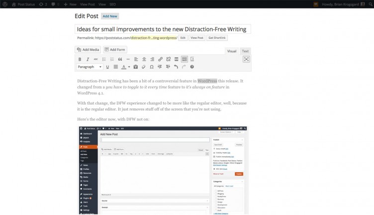
Distraction-Free Writing has been a bit of a controversial feature in WordPress this release. It changed from a you have to toggle to it every time feature to it’s always on feature in WordPress 4.1.
With that change, the DFW experience changed to be more like the regular editor, well, because it is the regular editor. It just removes stuff off of the screen that you’re not using.
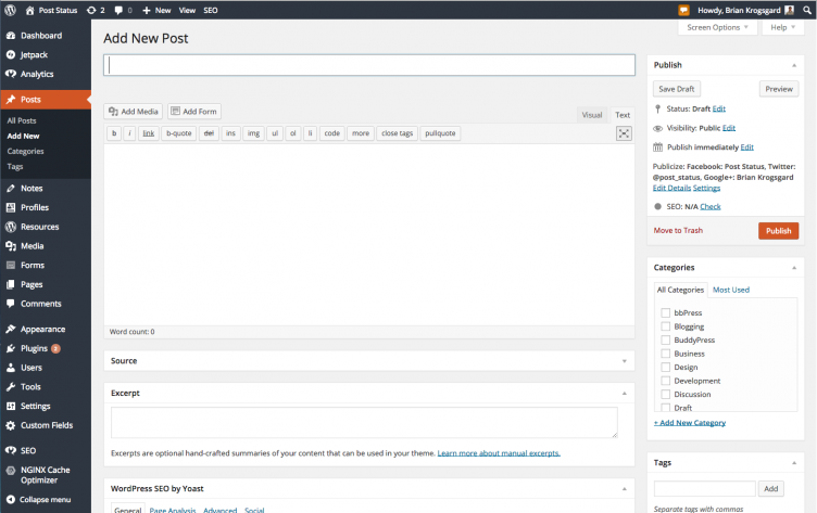
Here’s the editor now, with DFW not on:
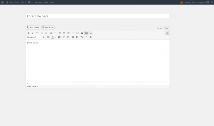
And here’s the editor now, with DFW on:
Jen Mylo wrote a post about how she doesn’t like the new feature as much as the old one. I’ve seen similar complaints a few times from folks.
The positive trade-off is that now DFW is much more likely to be used, since the setting (the four-arrow icon in the upper right corner of the editor box) is persistent for a user once enabled. Previously, DFW had to be toggled in each use, and was probably used by a minority of users.
4.1 was the first go at the feature in its new state, and I think it’s pretty great. I’m now using DFW every post I write, whereas before I almost always forgot to turn it on; plus, it previously felt like a commitment to the blog post.
Nevertheless, I think Jen’s critique (as well as others’) are noteworthy, so I decided to take some of the complaints I’ve heard and hack around in the browser inspector to see if I could alleviate them.
One thing Jen brought up was the height of the editor box. You no longer toggle the height from the bottom corner; instead it auto-adjusts with your content, and comes shipped with a default height.
Full-height editor box
She believes, and I agree, that it would be nice if the editor filled the available height of the window, because right now it feels a bit squished and cramped. Thankfully, we have the viewport height (vh) unit in CSS, and this can be adjusted with pure CSS and a few media queries.
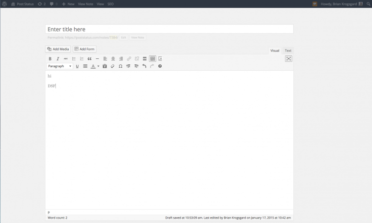
I think this is a progressive feature, so I’d be for using the vh CSS unit not using Javascript on this, despite the not-great browser support in IE.
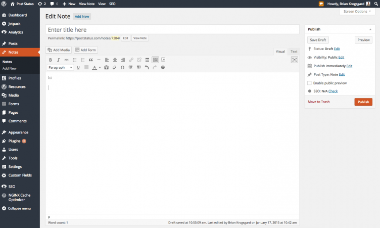
In fact, I really like this concept, even when not in DFW mode. It really calms me down, not seeing the metaboxes below the post content right out of the gate. We can just keep them right below the editor, just out of sight.
Centered editor in DFW
Another note Jen made was that she was bothered the editor isn’t centered in DFW mode. Well, I’ve never noticed that, but now I do, ugh. 🙂 It’s this way because DFW simply hides the right column and admin columns, which are not the same width, and therefore the editor is left with unequal margins.
Well, during the transition of those admin columns, theoretically, we could also move the editor box, though I think we should test what kind of UX effect there is of transitioning the editor your cursor is in. It might not be the most elegant solution.
Nevertheless, here’s what it’d look like once you’re done, including the full-height editor box.
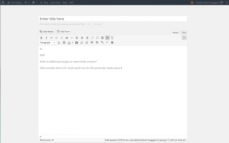
I’m iffy on this one. I really don’t like the idea of moving the box you’re actively focusing on. Needs testing.
Max-width on the editor box
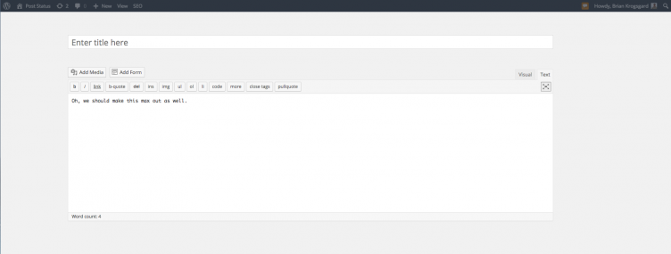
A critique I learned from another user was that the huge width on the DFW editor box bothered them. I agree. I think we should put a max-width on the editor box — probably whether the user is in DFW mode or not.
Here’s the large version that’s unwieldy, especially in DFW mode:
Inverted editor colors, with centered content box
One more idea: what if we inverted the WordPress admin colors, so that the background was white, and metaboxes were gray. And then, we could ditch the “container” of the editor box altogether.
Here’s a mockup of that.
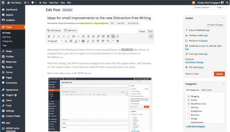
I think this could look really nice, but it would require a good bit of admin changes.
And then the Distraction-Free Writing version:
Save and Preview inline
This one is my own idea, based on drafting posts in this mode every day.
Distraction-Free Writing toggles on and off pretty rapidly as you focus in and out of the editor. When I write, I tend to save and preview the post live a number of times while I’m writing, especially toward the end of my time spent writing.
It gets a bit dizzying to be fixing typos and saving and previewing while going in an out of DFW.
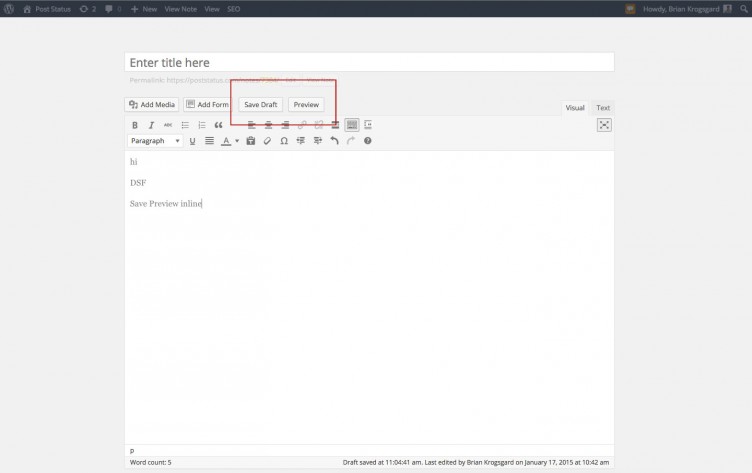
I’d like to see “Save Draft” and “Preview” buttons moved into the editor body, so that I can stay in DFW while finishing up my posts. Here’s what that looks like:
Iteration is important
Iteration in WordPress feature development is important. I’m glad we introduced Distraction-Free Writing in the first place, and I think the changes in 4.1 are worthy. They may need some adjustments, but it’s a process that will continue to improve.
Constructive feedback is always good. The more we use and figure out how others are using various features of WordPress, the more they can be improved.
In preparing to write this post, I was able to reach out in WordPress Slack and find out the best venue to give feedback, and if Jen’s post and this one help start a conversation, the changes can make their way to Trac tickets and eventual patches to make WordPress better.
I’ve seen at least a handful of folks say “Bring the old Distraction-Free Writing back!” That’s understandable; lots of folks don’t like change. Every UI-involved feature in WordPress ever has had critics.
But when you look at WordPress today and WordPress 5 or more years ago, WordPress today is way more beautiful to use. That’s because the experience the core team has built has iterated over time in response to use, feedback, and contributions.

You might want to check out my Just Writing plugin (wordpress.org/plugins/just-writing) which allows you to use the old DFW mode with enhancements.
Great post, mostly agree. The new DFW is better iterating a bit more could be great.
One thought I had as reading your ideas about centering the content editor, would be to make it take on a themes content_width value and be closer to Wysiwyg, ideally some day we’d get to true wysiwyg.
Ooh, I like this idea.
I always add an editor stylesheet with a max-width value on the mceContentBody class, to match (as closely as possible) the width of the post on the front end. A couple of clients have told me this makes editing posts much nicer as they have a better idea of how it is going to look. Adding the ability to set this width for the actual editor field sounds like an interesting idea. Maybe it could be done via a filter?
I wish WordPress and all other software in 2014 got rid of SAVE button. Considering how mobile and short-focused folks are these days everything should be auto-saved as soon as user interacts with it.