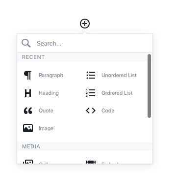
The editor blocks concept is being designed.
An extremely healthy conversation is happening on Make Design around what the behavior should be, and how people may interact with a block-style editor.

I’m really liking the general UI concepts, and most of the shortcut ideas, like using a / for quick-command access. Note that the image above is just an early representation.
One thing that confuses me is the discussion around using one press of the enter/return key versus two for starting new paragraphs. There’s some discussion around trying two presses in a new editor, which makes no sense to me. Asking on Twitter what use case there is for using a line break versus a new paragraph, the response was code and poetry (fitting).
Considering an extreme majority of new-line intent would be for paragraphs, it doesn’t make any sense to me to require hitting enter twice.
Another element I’m curious to see how the discussion evolves is around the buttons in the current WordPress editor above TinyMCE. Right now we have “Add Media” and it’s the most frequent place form plugins and others extend button functionality to.
In the current mockups there seem to be sections of buttons, so perhaps a registration and priority system, like in the customizer, could be utilized.
While I don’t think this design group needs to be thinking through every option for plugin extensibility, it will be important to figure such things out during a later phase of the project.
Also from a technical perspective, Matias Ventura has done a very nice job describing the challenges that must be addressed with a block system. Primarily, defining post_content as a “source of truth” while also allowing for independent blocks of both static and dynamic data.
Anyway, I like where the discussion is going. I could see this project taking most of the year, but I think WordPress will see enormous gains from a brand new editor and the inevitable technical achievements that will go with it.
