Layers is a product released by Obox today that aims to integrate page building into the WordPress experience.
Layers has the absolute best onboarding process I’ve seen in any tool like this. Also, the experience for creating new pages is very nice. While I have many disagreements with certain choices they made from a design perspective, overall I am very impressed with what they have done for the page building user experience.
Layers user experience sets a high bar
Layers has some very “wow” worthy features.
I am very impressed with Obox’s onboarding. Upon theme activation, it takes you straight to a progressive walk-through that helps you learn about and setup Layers. It includes videos that operate like playable GIFs that show you what it’s referencing in each stage.
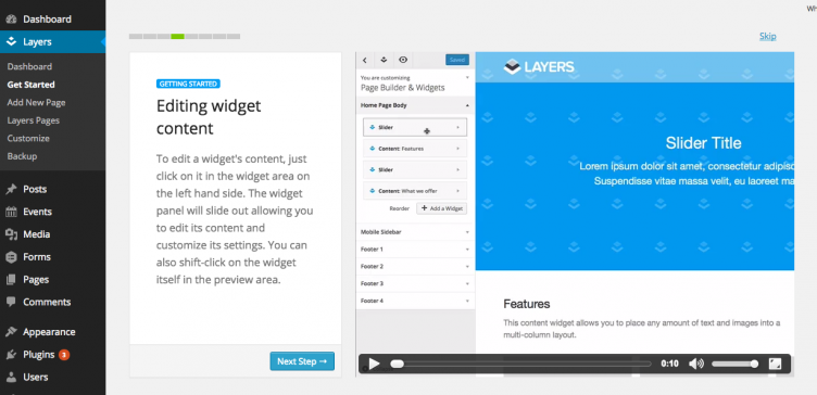
The editor itself is also impressive. Layers are managed totally through the customizer. There is a single customizer tab that opens up panels for Layer widgets, which is very in tune with default WordPress.
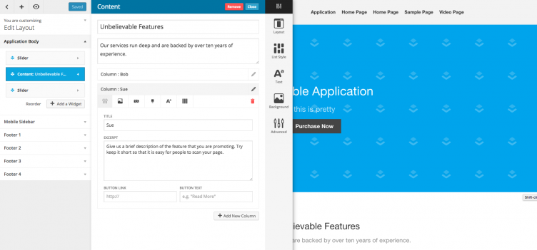
I call this method “going all in on the customizer”, which some people love and some people hate. I haven’t yet made up my mind, but I definitely like this better than many other methods I’ve seen — such as completely going outside of the WordPress UI.
Within the WordPress page itself, it calls you to go to the Layers customizer to edit the content, but also has options for duplicating, importing, or exporting Layers templates.
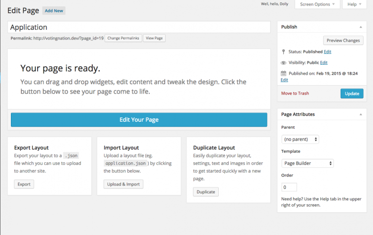
I like the way Layers makes getting started pretty easy. And I’m sure they will offer more templates going forward to help users quickly build pages that would otherwise require custom code.
Obox is really stretching their legs on UX, and they are unabashedly prioritizing UX over everything else.
David Perel — co-founder of Obox — tells me, “We believe in UX more than anything. Code is solveable; it just takes time. But user experience isn’t black and white.” I encouraged him to get more involved with core WordPress’ various UX projects, as I completely agree with his sentiment.
Behind the curtains of Layers code
When I first looked under the hood of Layers, I was completely baffled by some of the code decisions. Saving a page in Layers does not save anything to the actual post_content in WordPress, nor even in meta. No, content is essentially grouped — across any page ID — and stored in the options table, depending on the type of module in use.

So, if you view the options field of widget_layers-widget-column, you see this:
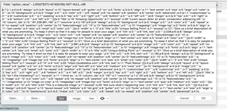
The above image is content for any column module in the Layers theme. Meanwhile, the post_content for the page you create is completely empty.
I was baffled by this architecture decision, as it means that I can never recover that content or use it again unless I’m using Layers. While the UX may fit well into the WordPress experience, the code seemed far, far from it; and it was a complete blocker for me. Then I talked to David Perel.
Thank goodness he showed me their backup tool. Before that, this post looked much, much different.
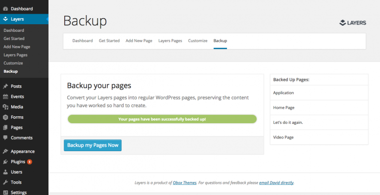
They are working to automatically port content to the proper field in the database, but for now you can manually do it, so that your markup at least is preserved for if you change themes. This methodology is in line with other responsible page building tools like The Theme Foundry’s Make theme.
I also talked to David about disappointing front-end performance. The theme loads 16 styles and scripts on every page, no matter what. Scripts like Masonry are loading — and more than one Masonry related script — whether the page uses Masonry or not. Those are just the scripts that are not conditional at all. On page inspection of some of their common templates, I was seeing well over 20 HTTP requests for styles and scripts. This simply should not be acceptable. This, at least, is fixable.
After discussing this with David, they are already working to implement a fix that will combine many of these files, and conditionally load others. Layers is 1.0, so while I wish this wasn’t an afterthought, I’m glad they’re moving fast to improve.
Overall, Obox is trying really hard on Layers; and they’ve shipped an impressive 1.0. They are doing active reviews still with some highly qualified WordPress developers whose names we all would know, and we can expect further improvements on performance down the line.
Where to get Layers, and notes on the monetization model
Layers is free, and on Github. They also have developer notes and general docs available. The Obox team is also working to get the product on WordPress.org, but there are some things they have to work out before they can.
For monetization, they intend to charge for pre-built child themes and commercial extensions. For now, they want to get mass adoption for Layers — a tactic that has worked really well for others in the space.
Thoughts on page builders
I am definitely not on the bandwagon for page builders, though it seems the WordPress product world is. Where traditional options heavy theme sales have died away, page builders have risen from their ashes.
I think anyone building a tool like this needs someone at their side forcing them to justify every feature — as it seems to me that most of these are giving way too many options in their products.
I may have a follow-up post in my mind that I’ll probably publish sometime soon describing why I think it is a bad thing for page builders (in the context of theming) to be the future of the web.
I’m afraid, however, that end user “demand” may make it so whether I like it or not; but it won’t be for their own good. I think there is a better way. I think “page building”, as it seems we’ve standardized the term, is broken when too many granular design elements are allowed. Instead, I’d like to see content building, where structured content can be created with a tool, but theming and styles are still left to, well, themes.
Tools like Aesop story engine, Make, and Layers are all making what I consider valiant efforts at evolving complex content creation for WordPress. I don’t think anyone is quite nailing it, but I like where at least these three projects are going for the most part. I’m happy to see Obox release their vision of what content creation should be in WordPress, with Layers.

I’ve been seeing a lot of these tools popping up, and I’m still not sure what to think of them. It seems like they’re mostly aimed at end-users and simple point and click sites – especially considering some of the technical issues you pointed out in this example.
We use Advanced Custom Fields “Flexible Fields” feature to build custom content blocks on our sites. We have a standard library of about 20 content blocks that we can pick and choose from when we implement a site, plus we can always add custom content blocks if we need them. The ACF interface is pretty client friendly but it’s also very developer friendly – no scripts or styles output on the front-end whatsoever. We have 100% control over every piece of markup, CSS, and javascript that is included on every page.
It seems like the core WordPress metadata UI API project has stalled a bit, which is unfortunate. I would love to see a solution in WP core that gives the kind of flexibility and power that ACF does. It always feels a bit dangerous to rely so heavily on a third-party plugin.
@Dalton, would love to hear more about your approach to ACF flexible fields and building your content block library. I’ve used ACF on a few sites, and I feel like there’s so much more I could be doing with it and, like you, repurposing the work for other clients. I agree that it’s a little risky relying on a plugin, but at the same time, ACF has been around a while and feels like a good choice.
Joe – I’ve been meaning to publish a blog post about how we use content blocks for a long time, and maybe putting some of our templates up on GitHub. The beautiful thing is how modular the ACF flexible fields system is – it’s really easy to add a new content type to a site and build a template for it. I think a shared libraries of ACF content block patterns could be really useful…hmmm… maybe I have a new project to consider.
Here’s a super quick video example of how we use content blocks in an unstyled starter theme: https://www.dropbox.com/sc/2zn9e1iqqgbrk5i/AAC1IFtrpcavYgj3utgzx_l-a
Feel free to shoot me an email dalton [at] madebyraygun.com if you want any more info.
Wow, I knew I was missing out on the power of ACF (I’ve mostly been using it for simple fields), and now I know how! Great video – that really showed me what’s possible. I had no idea.
Yeah, definitely do a blog post on that. It’s totally revealing. I went to the ACF demo video to see how I’ve missed all this… your video does a better job of showing how it can work.
A shared library of ACF block patterns is a great idea – I’ll be a happy consumer and possibly a contributor. If you’d like some help, hit me up at joe *at* merchantguru.com.
I’ve been keeping a close eye on the Layers launch (UpFront as well), and this seems to be a common sentiment. Developers are very weary about the thought of using a page builder. I honestly think it’s baggage from the DreamWeaver/FrontPage days. Page builders have come a long way since then and they can significantly decrease development time.
We love abstracting our work, right? Tools like SASS, LESS, HAML, CoffeeScript, Emmet all enable us to write less code and do more faster. A page builder can abstract writing code all together.
This is something that we learned very quickly after launching and using using Beaver Builder at our agency. We all love writing code. I’ve done plenty of ACF/custom page template work myself. I’d even say I miss writing code, but there’s no looking back when I can churn out a site in half the time by using a drag and drop tool. Plus, most of our clients can jump into the page builder and make changes to their site themselves after we deliver it! That’s huge!
Sure, there will still be scenarios where one will need to custom code and advanced or dynamic page, but we’ve found that these new-school page builders can handle 9/10 sites that come through our agency. They’re worth a shot.
Robby, I just tried the Beaver Builder demo, and I have to say I’m pretty impressed. Having the theme integrated with the Customizer, and the Builder plugin separate is a good combo. It was really easy to use without any documentation. And the design is clean and modern. This is challenging my desire to code custom stuff and just use something like this for “standard” sites! Dare I say, this brought some fun back into building websites. 😉
As for the code quality, I’d say it’s pretty decent. I ran my “Scroller Theme” demo through WebPageTest and PageSpeed Insights. The results were good but not great. Some of this is due to the demo server setup. Having said that, it scored higher out of the box than the twentyfourteen demo and probably better than most themes out of the box. Still, as a developer obsessed with speed (and I’m sure you are too), performance is one of the things I’d consider when choosing BB, Layers, or any other builder. I should probably try Layers now and see how it compares.
Thanks, Joe! Appreciate the kind words. Glad we could bring some fun back to the grind, haha!
I can absolutely relate to your concerns about performance. We’ve put a great deal of thought/development time into optimizing our theme and page builder plugin as much as possible. I have to imagine the folks at Obox are doing the same with Layers.
Granted though, using a Page Builder will introduce some overhead that could be avoided by hand coding (and some builders are much worse than others). Although, the same could be said about using a CMS versus creating a site with static html. 😉
I delved into this topic in detail in a blog post about page builders and SEO: https://www.wpbeaverbuilder.com/do-wordpress-page-builders-hurt-seo/
Naturally I am a bit biased, but I think it’s worth the minimal overhead.
Based on what I’ve seen so far, I’d tend to agree.
Hey Dalton! Wow, I didn’t know you could do that. Btw, have you tried Wp-Types’ Layout? 🙂 It’s supposed to be drag and drop, though I would need to run through the tutorial to get a hang of it
Having had the opportunity to give Layers a test run before everyone else (via a ThemeReview.co review), I had some of the same concerns about the page builder. From a UX perspective, it is hands down the best I’ve seen. It’s also very well coded.
From a personal standpoint, I’m not sold on the underlying architecture. I’m also not offering anything better, so that probably doesn’t matter. I think there’s some room for improvement, but the only way to get that is continued attempts at creating page builders and iterative improvement. Layers is definitely a step forward. I’m looking forward to see where they take it with version 2, 3, and so on.
We really enjoy the comments and feedback guys! We understand that data portability is a really big part of WordPress and so it’s part of our main focus with upcoming releases to make sure that page data from Layers is stored per page and neatly so that if a user switches themes, no extra effort is required to take their content across.
Awesome stuff Marc! 🙂 Do keep up the good work. Can’t wait to see where Layers is going. So, this was the secret project you were mentioning, huh
I have always been wary of page builders myself. But I’ve come to feel that some kind of limited page building capacity could actually bring real value to my customers. I asked Justin Tadlock what his ideal page builder would look like during his AMA at WP Chat. I thought his answer was quite interesting, though to be fair to him he was speaking off-the-cuff.
In particular, I like his idea that it’s connected to page templates. I think that would be a really useful and intuitive way to impose meaningful limitations on the end-user. These things are always, at the end of the day, geared towards non-developers. And good limitations will lead to better end products — but maybe not always happier customers.
I think this is totally spot on. Aesop and Make are the only two builders I’ve tried that I like, so if Brian and Justin see good in Layers it’s surely there. The heaviness really puts me off though. Make seems to be coming from the “justify every new thing” ethic.
And @Nate, yes the value of builders is to the end user who needs to be set up with a way to modify layouts easily, whether they can handle seeing any code or not.
Huge props to Dave, Marc and the rest of the Obox crew – been so looking forward to seeing this out in the wild and I’m super impressed with what you’ve put together. As a developer I’m not too fond of page builders in general, but the UX on display here really does make Layers stand out as a tool that I would actually recommend to users.
Nice work guys!
Thanks Hugh! It took us a long time to even consider building “yet another” page builder but we said from the very beginning that if we were going to do one we had to start from zero.
I promise there were some heated discussions about making one, for a loooong time, but at the end of the day the WP *theme* industry is heading this way so we thought “why not give it a proper go?”
I’ve not been a fan of layout builders but this is the first one that made me even want to try it, so I did. I can’t say I’m won over but I’ll wait until users, child themes and extensions show up. I’m interested to see how the ecosystem develops. I wonder if the right child theme plus the right sample content will be enough to help the average user build a website that looks great.
My worry is the same as always with layout builders. Typical users are not designers. If you give them too much control, there is risk of them creating an unattractive site.
I hope Layers will beat this. Let’s see!
I think your point about not everyone being a designer is exactly what we’re trying to solve, instead of giving them all the flexibility in the world we’ve tried to limit options to ones that look good.
An example is that you can’t set pixel sizes for fonts, you can only choose Small / Medium / Large. That way the user has enough control to stand out, but we make sure that the site they’re making will look good either way.
Not every builder is throwing in the kitchen sink or locking the user into a specific theme framework. Though I fully understand why they take that route.
It’s obvious by now how Mullenweg wants to reach his 50% and making the experience of designing a site *better* is part of that march. Like @Nate mentions above, limited capabilities is what most people need, but software makers are getting caught up in the arms race of feature count.
I think we should all realize that it’s coming to WP core/Jetpack at some point and that will be fun. Happy to chat more about the topic.
Hey Matt, with Layers one of our main intentions is to avoid the features arm race 🙂
Layers looks interesting as I look for the new best thing of 2015. I hate themes that made their own dashboard and the learning that took, I also support the native Customizer in WP 4.0+. ….However… doing the editing both of the theme setting and Visual Composer killer Layers I imaging would make it hard to have per-page design settings and be stuck with another version of one-look-fits-all look tweaked in one place.
I have not tested it so I could be wrong. As we go mobile I imagine less and less will be done on the backend and editors that can work on the front side once logged-in might be better suited then on that can ONLY be done in WP Customizer mode.
Will follow this product for sure! WooCommerce is a juggernaut and before it’s time so it will be interesting to see where this goes.