I’ve always wanted to write a post on Medium. But I’ve always been too greedy to do so, because I like to own my content, and I’ve never had a topic that I really wanted to write about that didn’t better fit on my personal blog or this one.
That changed today, so I got to experiment. On hearing that Teehan+Lax shut down, I felt it was a worthy time to try Medium. I had a bone to pick with their exit post, and they helped design Medium’s first version, so it seemed fitting.
Here’s a link to the finished product. Until today, I had never really done anything to play with their editor beyond look at it and write a few sentences to see the basics of how things worked.
First impressions of Medium’s editor
Medium’s front-end is beautiful. And the back-end looks quite similar. They try to take pretty much everything out of your way to leave you to your words. I like that.
The only problem with simplicity is that it can obfuscate how to actually do stuff. In the case of the Medium editor, there are two methods to interact with text.

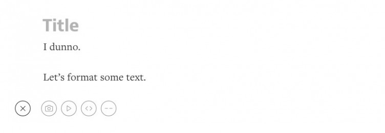
First, you can click the little plus button, which allows you to insert a pre-formatted block of something.

Second, you can highlight text and get a tooltip of formatting options.
Some of these options are confusing. The tooltip one was fine, but the + button was tougher. I didn’t know what to expect by clicking the horizontal line or the play button. I thought the code brackets were odd, as surely not many people are putting code on Medium. It turned out that was an oEmbed button.
Eventually though, I figured out roughly how to do what, even inserting those big full screen images everyone associates to Medium.
For most people and most posts, these tools are enough. And all in all the experience was delightful, despite this minor criticism. However, a part of me wanted more.
I like the persistent editing buttons of WordPress (though I could definitely do with fewer options in TinyMCE). I even felt a little weird about Medium’s previews. It’s basically a front-end preview when you edit, but it’s also not quite teh same. For example, you don’t get the below post items and other elements that affect the overall feel of the page, versus just the article.
Still, I think the WordPress editing experience could learn from Medium’s efforts, even if we don’t mimic it entirely. And I do think the recent changes to Distraction writing help get us there.
Simple but effective stats
Medium has stats built-in. With WordPress, most people use WordPress.com’s stats module through Jetpack, or Google Analytics, or both.
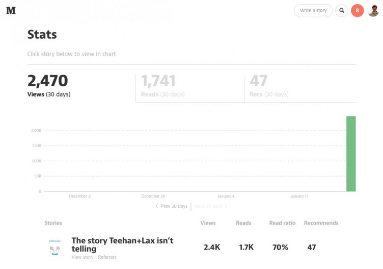
Medium really trims down the stats information. You basically get a few metrics: Views, “Reads”, Read Ratio, and Recommendation counts.

I love the read ratio stat. Medium’s reliance on reading versus pageviews is pretty well documented, and I’ve always thought it was great. But what I realized nearly immediately is that this gave me much greater assurance that my post is quality or not, versus metrics I have available to me with WordPress.com stats or even Google analytics.
I usually determine quality of my posts based on how many tweets, comments, and pageviews I get for an article. This is great, but just because something isn’t shareworthy doesn’t mean it’s not high quality. Also, if I get 200 views but nearly everyone fully reads it, it’s better than getting 1,000 views where only 200 read it.
In the latter example, I got views but I didn’t impact. My goal is to impact, and Medium’s “reads” stat helps me determine that very quickly.
Referrals are also nice on Medium. I can quickly see where traffic is coming from, real time, and go see what that referring source said about my post or take part in the conversations.
Most importantly, regarding referrals, is that I can see them per article. This is a feature I would love to see hit WordPress.com stats.
Hardcore stats folks won’t be totally satisfied with Medium. And to my knowledge, you can add your own Google Analytics account to your medium account, so you have to live with what you get. For most of us, that is enough.
I think there is a ton of opportunity for a solid stats plugin for WordPress that either makes great use of Google Analytics within the WordPress Dashboard, or rolls their own (outside of WordPress.com / Jetpack).
Medium-sized exposure
One element I was pretty curious of was exposure. I know that some articles have done really well on Medium, but I’m not sure what causes that.
In my case, the article has had a couple thousand pageviews in a matter of an hour or two, so that’s great. However, I think it took off on Twitter and Designer News much more so than from Medium itself, besides recommendations
For recommendations, it’s like a rolling snowball. I get emails from Medium every day telling me what my Twitter friends recommended on Medium. I imagine that the more people recommend my story, the more email and other distribution the story gets. That’s good, because I’ve always figured recommendation buttons were mostly useless on sites, and really only social proof for other would-be readers that are already on some kind of archive.
As far as I can tell, Medium doesn’t really have a way to highlight new stories beyond recommendations. And they very much de-emphasize post dates and time-based feeds.
Tag, you’re not it
One last thing was categorization and tags. Medium no longer allows regular users to put a post in any particular category, as far as I can tell. You have to be some sort of more-certified user or author to put a post in one of their channels or tags or whatever they call them.
I thought this was a little frustrating. Without some kind of tag, how can I put my story in a feed that others that don’t already follow me can find? I think it has potential to prevent lesser-known writers from ever being exposed to more eyeballs, because there is a much smaller initial audience to read their post.
Furthermore, if I had 100 or 1,000 posts on Medium someday, it would make it harder for me to filter my own stuff. I often go back to certain categories on Post Status to see what I wrote about a particular topic in the past.
Notes and public previews
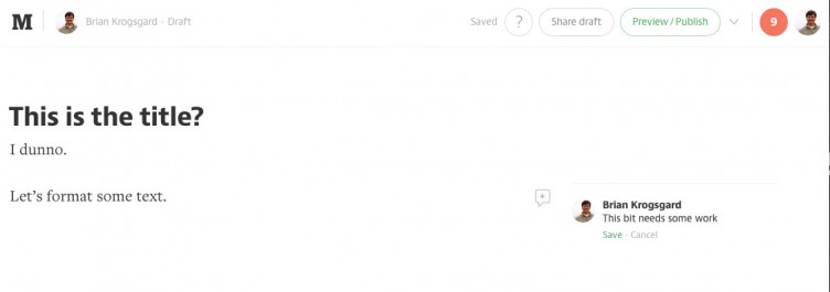
A couple of things that Medium excels at are notes and public previews. I can easily annotate my post in the margins, without putting the notes in the content (which I often do in WordPress). It’s very similar to Google Docs.

And public previews and draft sharing is exceptional. I have public preview functionality on Post Status, and it works okay; it’s built into Medium, and it has great placement and is easy to use.
I think WordPress could build these features in. They simply make publishing better. Nearly every site could utilize a tool like this and I think that while there are plugin options for accomplishing these tasks, it’s pretty core to the experience and mission of publishing.
Plenty to gleam, but not a silver bullet
All in all, I liked publishing on Medium.
No, I don’t own the content. Though they do have a one-click button for exporting everything you’ve ever written. (edit: reader and former Medium employee Evan Solomon notes I do own the content itself. I guess I mean it more in the sense that I don’t own the platform, and can’t guarantee my content will always be there.)
I also can’t use my own domain. If I published there long term, that would be a problem.
It’s unfair to compare Medium directly to WordPress. But from a publishing perspective, I’d say there are definitely elements WordPress could learn from. However, we shouldn’t just jump completely on the simplification bandwagon.
Now, in terms of who can definitely learn from Medium, it’s WordPress.com. If I were going with a hosted platform, owning my own domain and being able to choose my own theme are pretty much the only reasons I’d choose WordPress.com versus Medium. The overall account (especially) and publishing experiences (marginally) feel more polished on Medium than WordPress.com.
I don’t know if I’ll publish on Medium again. Probably, when I find a circumstance that this blog or my personal blog aren’t the right place. It was fun to play with a shiny new tool, but I’m still a WordPress guy, and I think we’re doing alright.

Been a huge fan of Medium since launch day – so much so, that my blog theme and approach to content takes a very similar visual cue from it.
But completely agree that some things about its UX are weird. For example, the large featured image header is great – but it’s not too clear as to how you overlay your headlines on it.
Additionally, the “Add New Section” feature (to break up long posts) could be better implemented.
But, like I say, I love the platform, and very much (for me) the way content should be produced and presented.
Great piece about the Teehan and Lax deal, too – cheers!
Thanks Danny! Yeah, adding the big wide images was a bit odd. Especially in how I could then just write all kinds of text on top of it. I wish especially the top of the post bits (Title + excerpt + wide image) made more sense. Thanks for dropping by, and I’m glad you enjoyed my articles 🙂
Easy, simple and fast! I like Medium too, but it didn’t use it because I can’t use my own domain name. What if the stop the project after a year? Sure you can take your content to some other platform, but all your links and traffic is gone…