A couple of months ago, Mark Uraine described the thinking behind what is now likely to be a new landing page at WordPress.org/get:
For quite a while now, the meta team has been interested in improving the download and mobile pages on WordPress.org. Unofficially, we’ve been referring to this as the “Get WordPress” project.
A small team has been working to iron out the information architecture and wireframes for what this page could look like, and they recently shared the results of that work.
Under the proposal that was preferred by the team working on this, the big blue “Download WordPress” button will be replaced:
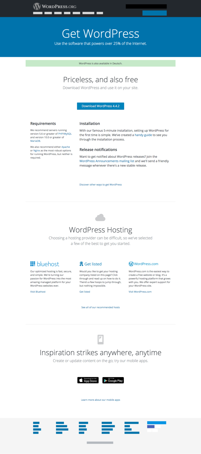
A third option is to rename “Download WordPress” to “Get WordPress,” and create a new landing page (/get/), removing the other two navigation items. Get WordPress would provide an overview of the WordPress mobile applications, a download button for the WordPress zip, and links to preferred hosts, as well as WordPress.com (this currently exists)
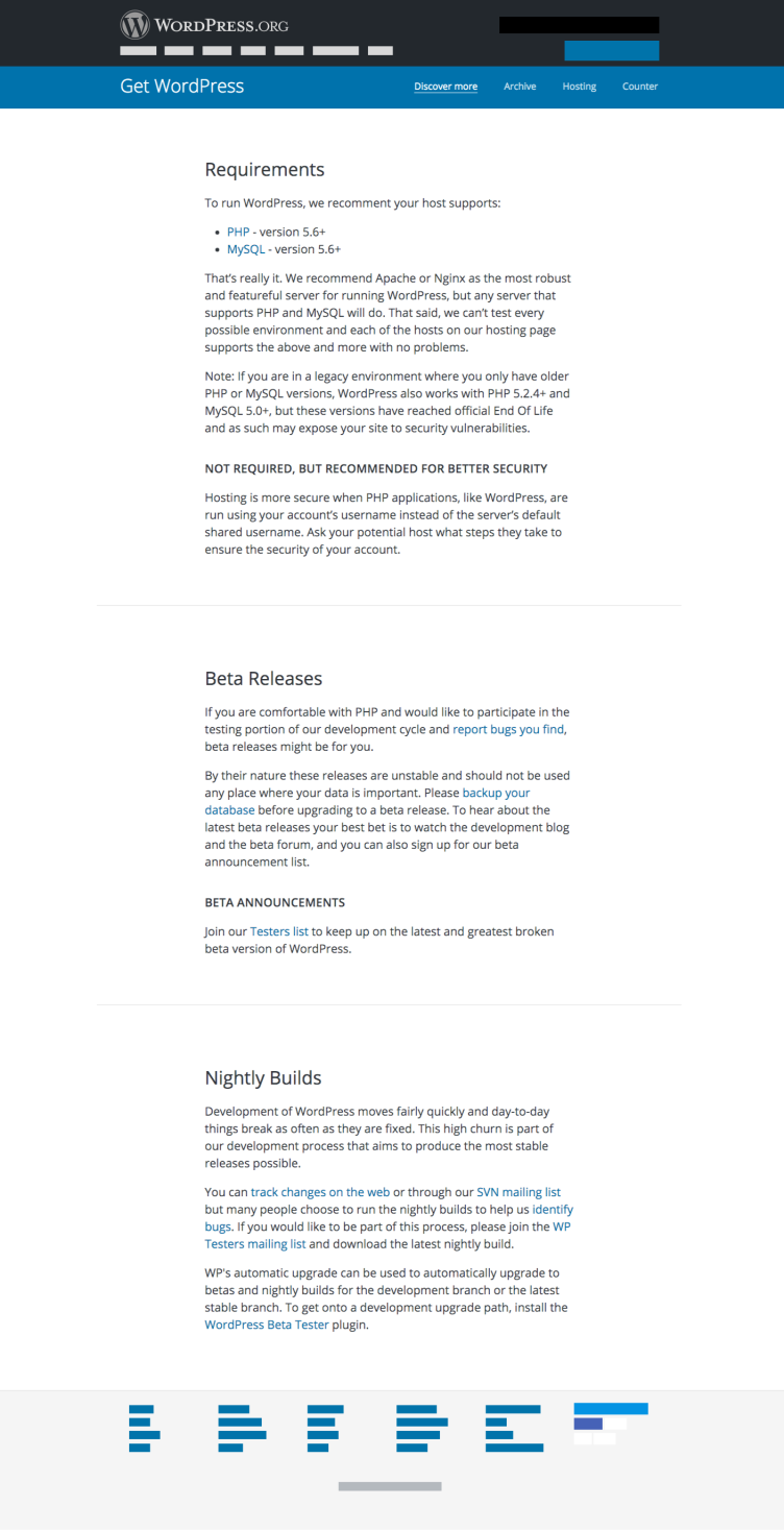
After an initial set of designs and feedback, a “final” set of mockups has now been proposed, as seen below. Click the images for full sized versions.
The main page is currently planned to look like this:
And the sub-page:
In general terms, I really like the idea of “Get WordPress” replacing “Download WordPress”. And I think the mockups do a pretty good job with the data, and also fit pretty well into the design structure that was defined in other projects like Developer.WordPress.org. I think my primary hold-up is the prominence of the hosting recommendations.
As noted by the team, hosting recommendations are already on WordPress.org, but I don’t personally like the prominence of the recommendations on the main landing page, especially in identifying a specific host, as well as WordPress.com. I think this section focuses on a very gray area of WordPress.org, and also (unfortunately) helps blur the lines between WordPress.com and WordPress.org.
So, my beef is less with the project’s overall direction and more with the fact that this section of the landing page highlights a highly political part of WordPress.org and can also cause confusion. This will be a prominent landing page (the destination of the biggest and most visible button on WordPress.org) and I don’t think that part deserves so much attention, especially considering the state of the current hosting page, but I’d feel that way even if it were up to date.
Otherwise, I think the page is great, and is a potentially great area to put other future marketing documents that could come from the Make WordPress Marketing effort.


