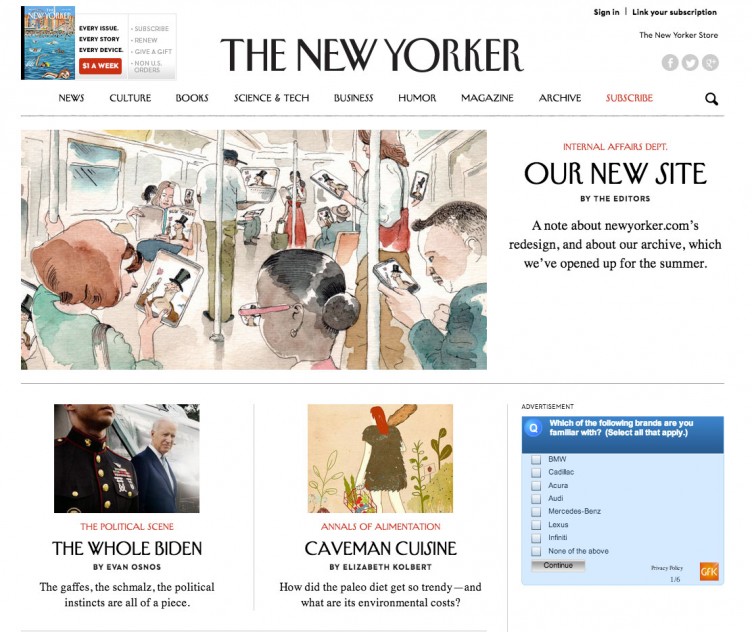
 The New Yorker is an iconic magazine that’s been in print since 1925, and its online web presence is now on WordPress. Reported in the New York Times originally, the New Yorker is altering its online strategy, broadening the number of magazine articles available for free online.
Their archive is now completely viewable online, going back to 2007. The magazine will be making those archives and other older articles free for three months. That period starts today, in what they call “a summer-long free-for-all.” They’ll use that data, which the New York Times says will be sponsored content, to determine how to structure their paywall moving forward.
The New York Times shared some details on the (then) pending launch:
The new site, designed to be cleaner, with new typefaces, will be based on the WordPress publishing system. It is expected to be easier to navigate for mobile users — among the fastest-growing segments of the readership.
The New Yorker said that it was making the change from a position of strength, after having its most profitable year in decades in 2013. The magazine has nearly one million print subscribers, and in May its website had nearly 12 million unique users.
Technically the new site is enjoyable to use. The layout if fully responsive. Their recognizable fonts are being served by Typekit. It appears to be self-hosted and not on WordPress.com VIP. It’s also fun to peak at Condé Nast’s Github to see some tools they’ve been using for the new website.
One of my favorite parts is how the editors closed the post announcement the new website in the post about the launch:
A final point—and, arguably, the most important. Publishing the best work possible remains our aim. Advances in design and technology are tools in that effort. In all forms—digital and paper—we intend to publish in the same spirit of freedom, ambition, and accuracy as Harold Ross did when he prowled the halls nearly ninety years ago, the latest model of pencil stuck behind his prominent left ear.
The New Yorker is a big win for WordPress. It’s a reputable magazine, making a big push on the web, under the umbrella of parent company Condé Nast — a huge influence on media, and they’re choosing WordPress as their tool to make that push.
And that makes me glad.

beautiful design!
Such exciting news—both that The New Yorker is on WordPress and that we can spend the summer exploring the whole archive! The site really does look a million times better now.
Another great post Brian. I agree—the image of Harold Ross with the pencil behind his “prominent left ear” is a wonderful way to end.
(P.S. I recently discovered The New Yorker Fiction podcast, it’s my favorite thing to listen to in the gym! Highly recommend it if you’re into that sort of thing).