
I am far from a typography expert, but I do love playing with type. I delight in a great reading experience, and I strongly believe typography is the key to creating a great reading experience.
In my own journeys searching for and choosing typefaces for my projects, I’ve discovered some great tools, and also some pitfalls of using different delivery services.
I have Typography.com and Typekit accounts, and of course using Google Fonts is very simple. Many folks also use Myfonts, generate their own on Fontsquirrel, self-host direct from foundries, or use a variety of other methods.
When you use a font delivery service, where the font is hosted elsewhere, and you simply connect (like Typekit or Typography.com), one of the things you deal with is the authentication of your site with the service that can often cause sad delays in pageload times. Zach Tollman did a great post discussing how Typography.com in particular is not good at handling this authentication, from a performance perspective.
Given that I host Post Status fonts on Typography.com — I use Gotham Round, Gotham Condensed, and Sentinel here, and none of them are available anywhere else — the hit on performance perturbs me. However, I love these fonts and hate to replace them. However, I’ve lately been doing some research so I can at least test font stacks from Typekit and Google to see how big of an impact it could have.
Finding Typefaces
Finding quality typefaces is a challenge. There are so many out there, and the differences in quality can be vast. Part of what I love about Typography.com is that the quality of the display and cross-browser rendering is outstanding. Typekit serves typefaces from a variety of foundries, but they too have built great tools over the years to try and ensure quality rendering. Google is more of a mixed bag, though open source typefaces are getting more attention to detail in recent years than ever before.
By far, my favorite tool for browsing and finding typefaces is Typewolf. Typewolf has PDF guides (free with your email), trending typefaces, sites of the day, and high quality recommendations on when and where to use a particular typeface. A sample resource that’s outstanding is their list of the top 30 open source Google fonts. They have many others like that. It’s definitely a must-visit site when you are considering changing up your site typography.
You can also browse delivery services directly. Typekit’s lists are pretty good for narrowing typefaces by their intended purpose. Justmytype is another great resource that shows recommended pairings for fonts from Typekit and Typography.com. And of course Google has filters in their directory to help narrow it down, but it’s still a bit of the wild west, so I usually rely on Googling good pairings for Google.
Tinkering with typefaces with real content
Once you find some Typefaces you like, then it’s fun to put them into practice. Typecast is excellent. You can find fonts from many foundries with a free account, and do all sorts of manipulations to see the typefaces in action, using a variety of font combinations, before you move to your actual site.
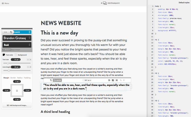
Beware, it’s easy to spend hours in this tool. I love that you can edit the CSS directly, and there are also tools within Typecast to insert particular types of content, so you can have a working prototype pretty quickly.
Performance implications
Loading fonts is a huge performance issue sometimes. Too many fonts, content blocking loading, time-outs from third party delivery services, and other gotchas can severely impact a site’s load times.
Anytime you are looking at new typefaces to use, consider where you can serve them from, whether you can self host them, how the delivery authenticates, and potentially more — before you get your heart set.
Some good rules of thumb are this:
- Google is by far the fastest, but you just don’t have access to some of the greatest font foundries this way, because all Google fonts are free.
- Self hosting is probably similar to or faster than serving them from Google. Most Google fonts are locally cached on lots of folks computers. Self hosting may be better for a more rare font, but for common fonts, Google may actually be faster.
- System fonts are always the fastest, but you might not be able to deliver your preferred typeface if the system the reader is using doesn’t support the typeface. If using system typefaces, creating thorough font stacks is a necessity. Sometimes, especially for sans-serifs, I’m tempted to just declare sans-serif, so that the system serves its favorite font — as Android, Mac, iOS, Windows, et al each have their own defaults. For serifs, I’d say just use Georgia if using system fonts only 🙂
- Typekit and Myfonts and other delivery services are usually similar in quality, but it’s one of the slowest options for delivery. Be sure to only use the weights and versions you need, and considering limiting character sets if you can get away with it.
- Have a performance budget for your type. Sometimes you have to make hard choices. Does your body font really need to be a non-system font? What if you just used a single display font to add the character you seek? Can you get away without italics for a certain typeface you’re using? What about bold? If you use the regular/bold/italic/bold-italic for every typeface, that adds up quickly. Use the bare minimum and add whenever you need to only.
Don’t get too fancy, and consider your tone
My biggest mistakes over the years playing with type have been getting too fancy, especially with body copy. Simple is good with type. Especially when choosing body copy, be sure to learn about the typeface you like — and don’t just trust your own eye early on — to see if it’s an appropriate workhorse typeface.
With display type, you have more leeway, but consider the mood that the typeface sets. Slabs, serifs, gothic, humanist, and other styles of type each tend to have their own tone that they set. For instance, when you read the New York Times, Georgia is a serious workhorse font, and the custom display font also sets a sober tone. Compared to Vox, for example, which uses a more casual sans-serif body copy and quite decorative display typeface. In both scenarios, readability is very good, but they set a different tone.
Learning typography takes time
Learning and understanding good typography practices takes time. Many factors are at play to make a typeface look great, and even the greatest typefaces can get screwed up when not used well.
Learning best practices for things like line length, line height, pairing, and much much more can probably get you farther than what typeface you choose. And different typefaces obviously do better in different settings. The key is to take it slow, learn what you like when you are reading other websites, and see what they are doing that you are not. Also, ask your friends about your choices and get feedback; sometimes just a minor change can make a big difference, and suddenly your design clicks.
We can easily be blind to our own typography mistakes. If you can limit mistakes and learn the essentials of choosing typefaces and using them well, your websites will look much, much better and your readers will be thankful, even if they never say it.


Are you familiar with Brick.im? They have a variety of common fonts, but they contain more stylistic flourishes than the condensed fonts hosted by Google Fonts; this results in bigger file sizes, but the fonts look nicer.
I am one of these people. I find it very difficult to match ‘typography’ types. In fact, I just called them ‘letter styles’ or ‘decorations’ until I found out the proper gloss…which was just now. I would have a hard time choosing which shirt goes with which pair of pants, tie, belt…etc, if they didn’t actually sell complete ensembles in a single box. Even then, I have to trust someone else judgement that it looks right.
Thanks for the insight. Very informative. I have gained a curiosity in the philosophy of typography.
Another important thing that most font providers have, but people tend to ignore, is language subsetting. Once you have chosen your font, just include the group of characters you *really* need. For example a really popular font like Proxima Nova weighs 350kb in Typekit by default but if you choose just the English characters it goes down to 73kb.
Typecast is such a cool tool! Thanks for introducing me to it as I am slowly taking typography seriously.
For basic typography considerations, I’ve found no better source than Matthew Butterick’s: http://practicaltypography.com/
A great start is: Typography in Ten Minutes
Google has wide wide variety of fonts, but had speed issues. Anyway good luck for your new innovative ideas.
Thank you for the awesome tips. As I continue to develop some of my websites, I will certainly be learning more about typography.