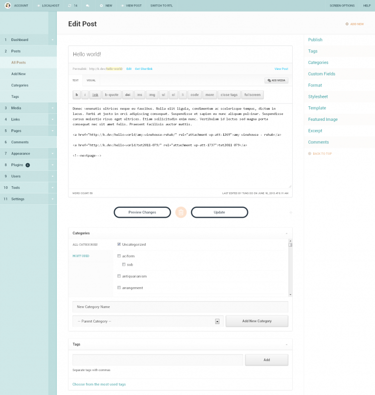
 Tung Do has released yet another iteration of a custom WordPress admin design at DevPress. I’ve seen Tung experiment with a black version, a white version, and a “Hunter” version. And now he’s consolidating the previous three themes to one, a green version.
I definitely think it’s pretty in its own way, but I don’t understand why he’s done some things, like making it green. I also don’t think the numbered left navigation is intuitive at all. This project may be a fit for a small niche that’s interested in toying with a pretty skin, but I don’t really see how it’s solving core issues of making it easier to publish within the WordPress admin.
I do like that Tung used the Dashicons from MP6 and his efforts on the responsive bits. I think he’s a talented designer. And I know it takes him a long time to do this. I’d love to see how those efforts could be channeled into a more official channel with the MP6 team or the UI group in general.

Thanks for covering DP Dashboard, which I thought you wouldn’t after our mildly heated discussion regarding WP news. I guess that’s what I get for judging a generous person using selfish standards.
About the plugin, while the numbered menu isn’t intuitive, it’s no less efficient than the icon-ed menu we have now in WP core. Text is still the best interface for this area and I made sure to use a big font size. Numbers are simply there to help create anchors for most used items. I realize someone managing multiple WP installs will get tripped up by all the numbers, but the same could be true in an icon-ed set up. It’s like asking a girl out to coffee or dinner. The goal is the same, to get the girl to go out with you.
The numbered menu disadvantage is it has NOT been widely used. Most users switching to DP Dashboard will need a day or two to switch their brain off of icons.
However, numbered menus are more… future-proofed and are not plugins dependent. Granted, I’ve not combined the numbered menus with keyboard shortcuts, but you can imagine it becoming exponentially more useful if they are combined with shortcuts. That’s definitely something I want to look into for future updates.
For the rest of the features, their benefits need to be experienced first hand because my focus going into this update was the experience. I feel the collaborative environment we have in WordPress trac isn’t suitable for emphasizing the overall experience, which is one of the reasons why I’m not involved in MP6.
Admittedly though, help from such a large team like the MP6 contributors list would have been tremendous. Working with the admin UI REALLY tests your patience. It’s taken me more than a month to complete this update, which still is only the groundwork for what’s to come for DP Dashboard.
If you have any other question, I’d be glad to explain some of the ideas in this DP 3.7 update.
Also, I’d like to send you a copy to experience it first hand (contact me at my email so I can attach the file to the email reply).
The advantage of icons over numbers is that the default icons stay consistent across all your installs. Numbers will change depending on the plugins installed and where they choose to insert themselves in the nav list. For example, if a plugin puts its menu after Posts, then Pages is no longer #5. If its a new install, Links will be missing and Pages won’t be #5. So if you’re tying these numbers to keyboard shortcuts, there won’t be any consistency across installs. Keyboard shortcuts would be better attached to letters that are consistent regardless of position in the menu.
Either way I’m glad to see people hacking at the WP admin. It’s much needed.
Valid point and it’s something I considered too, which is why keyboard shortcuts aren’t linked to those numbers yet.
Consistency is good during chaos (installing and uninstalling plugins everyday), but not many people do that (constantly installing/uninstalling plugins that add first level menu items to the admin menu).
Numbered menu is an idea I’m going to keep exploring for now. Thanks for the feedback.
Interesting theme. I actually like the clean flat appearance. Nice work. Now integrate a live markdown preview into it….