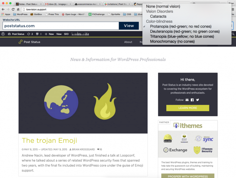
A website was shared at the CodePen Boston meetup that makes it easy to test for various low-vision disorders, called lowvision.support.
It’s really simple and quite useful, especially for the varieties of color-blindness. Here’s Post Status in one of them:

Definitely put this one in your tool belt. Apparently it has more features on the way as well.

It looks like text below 36px is unreadable in “cataract mode,” but as long as the main body text can be resized up 200% without assistive technology or loss of content or functionality you are WCAG compliant. That won’t necessarily help one of the 1.3 million people who meet the US statutory definition for blindness with 20/200 (or worse) corrected vision in one eye, which means characters that fill a line height of almost one inch that a person with 20/20 vision can read from 20′ away.
Something I’ve never seen addressed involves the other half of the US definition of “legal blindness” — a maximum field of vision that’s 20 degrees in the better eye. That means they can only see half of a 22″ screen that’s 1.5′ in front of them.
That’s a really interesting point, Dan. I wonder if those users benefit greatly from “tablet”-size responsive site breakpoints.
Also, two more interesting and powerful tools that are similar:
– NoCoffee (very similar to above) https://chrome.google.com/webstore/detail/nocoffee/jjeeggmbnhckmgdhmgdckeigabjfbddl?hl=en-US
– Color Contrast Analyzer (really useful for text over image) https://chrome.google.com/webstore/detail/color-contrast-analyzer/dagdlcijhfbmgkjokkjicnnfimlebcll?hl=en