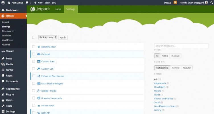
 Jetpack 3.0 has just shipped with a major overhaul of the admin area. I’ve long desired change, and Jetpack has finally made quite a significant one. The settings page is still very heavily Jetpack branded, but the interface for activating, deactivating, and managing the various modules is vastly improved.
In addition to the UI changes, Jetpack has a number improvements related to sharing, a new module for verifying tools like Google Webmaster Tools, infinite scroll improvements, better tiled galleries, and more. But the big winner is the UI. And it was long due.
I’ve been a heavy critic of Jetpack over the years, and I still don’t like how some things are handled. For instance, I’d still love to see modular plugins such as Jetpack have a way of more one-off management vs be huge behemoths like Jetpack. But that would require more lower level changes, like proper core plugin dependencies. But the Jetpack team really is quite open to feedback, contributions, and advice. I’ve had nothing but good experiences with them, and they do a great job of offering WordPress.com features to .org users.

Awesomesauce. With ya on one-off management. Not sure if it’s the same with other modules, but I’ve yanked the infinite scroll out of Jetpack and run it as its own plugin, rather than having to have Jetpack in its entirety installed and activated.
Do you still need a dot com account to use Jetpack?
Yes.
I love this. I work with WordPress everyday, and until now I didn’t realize you could turn a lot of this stuff off. Should help tone down a bit of the bloat if you’re only using the stuff you need I’d think.
I really like the new UI. It threw me off when I first got the update, but it looks great and I could get used to it. Updating all sites now.
I agree that Jetpack is confusing, sometimes annoying, but I think this is a good step in fixing that.