Jetpack 4.3 Beta was announced today, and includes a new React-driven interface, as well as more integrated marketing pitches for the WordPress.com apps and paid upgrades.
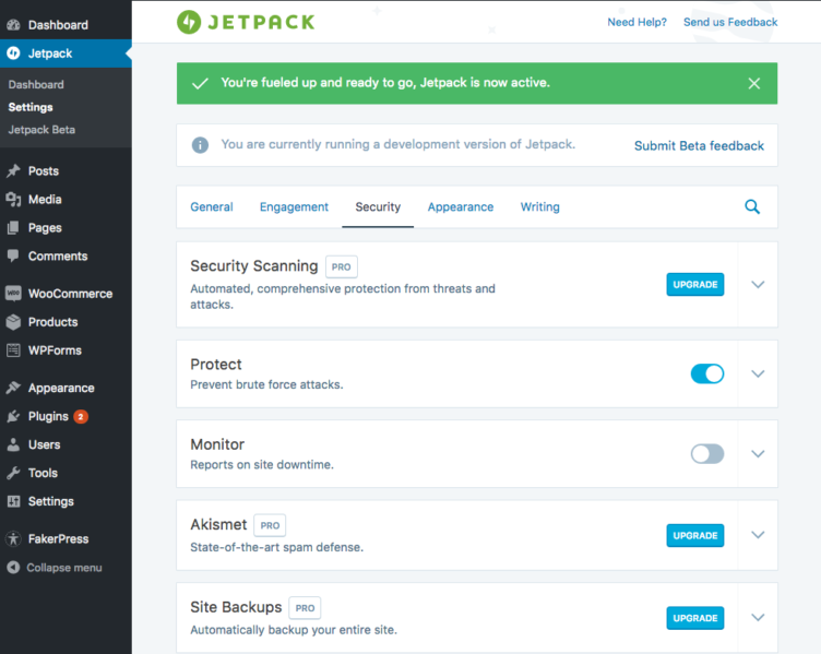
The new interface is an improvement, but there are several changes functionally. One I noticed was that you can no longer bulk-activate or bulk-deactivate modules, but instead it’s an instantly saved state based on a toggle trigger, and modules are separated by category.

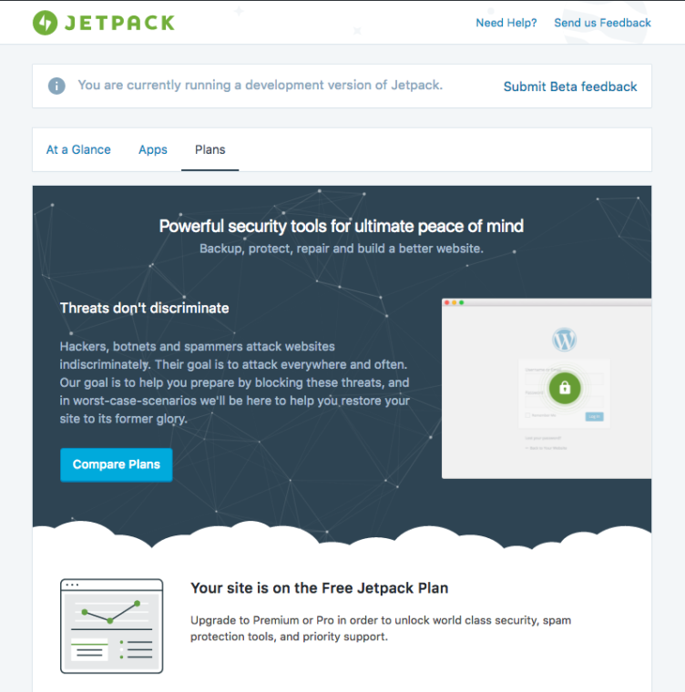
That’s the view from “Settings”. The dashboard view has three tabs for “At A Glance”, “Apps”, and “Plans”. The apps and plans tabs are both marketing pitches, the former for the desktop and mobile apps, and the latter for paid bundle upgrades for Akismet and VaultPress.

Jetpack has long set the example for other plugins, and overall I like this upgrade. The marketing pitches are certainly more aggressive than they used to be, but they aren’t offensive, and the overall look and feel — as well as general speed of navigating through settings pages — is greatly enhanced.
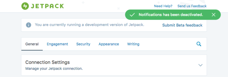
I love interacting with React as a user. It feels so much faster, and usually it is faster. It is also really nice how saving works, though I’m not sure I like the home-grown confirmation notifications Automattic has created, purely because it’s a good bit outside of current WordPress norms. That said, the previous green-cloud banners on Jetpack pages are thankfully a thing of the past, so I guess it’s a trade.

Jetpack definitely feels a good bit more WordPressdotcom-like now, and I’m sure that is inline with Automattic’s goals. Over time, the Jetpack dashboard has the potential to be a bigger and bigger window for various Automattic products. For instance, imagine browsing commercial themes, or upsells for things like WooCommerce extensions, or who knows what else. Time will tell how they utilize that valuable real estate.
