 WordPress 3.8, “Parker”, has just been released. WordPress 3.8 is the result of four months of hard work by 188 core contributors. Named after Charlie Parker, jazz saxophonist and bepob innovator. WordPress 3.8’s development was led by WordPress co-founder, Matt Mullenweg.
WordPress 3.8 is the first release cycle ever where all major feature development began with plugin teams. The first brain storming session was August 8th, where people shared around twenty ideas for which plugins should be developed for inclusion into WordPress 3.8 as features.
Willing contributors chose which ideas they were interested in and teams formed around those that received early traction. While a number of teams are still in active development for future merges, four did proposals for inclusion in 3.8, and three features-as-plugins have shipped with the final release, plus Twenty Fourteen of course, the new WordPress default theme.
The most notable features of WordPress 3.8 are:
A new admin design (MP6)

The WordPress admin has changed a good deal over the years. You can take a walk through time with this blog post. The change in 3.8 is arguably the biggest ever, but definitely since WordPress 2.7, which was released in 2008.
Originally code-named MP6, the new admin design was first submitted to the plugin repository ten months ago; it was the most obvious choice for a plugin to be merged into core.
The entire administration area is now responsive. I think all images used for styles have been dumped and replaced by pure, modern CSS. Icons now utilize vector icons, called Dashicons. The default font is now the open source Open Sans.

Also, quite notably, there are now eight default skins that ship with WordPress core. This is made much easier thanks to new build tools that were adopted with the release of WordPress 3.7. With this opportunity, the WordPress admin styles were ported to utilize Sass, making building color schemes simpler.
I really look forward to a great deal more customization being made possible in the WordPress admin due to the groundwork in 3.7 with build tools (the WordPress Gruntfile is fun to explore) and adapting the admin in 3.8.
Mel Choyce also did an outstanding job outlining the changes in more detail in her proposal for the merge.
The Twenty Fourteen theme
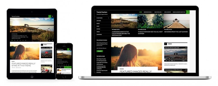 Twenty Fourteen is a bold WordPress theme (view the demo), designed with a magazine layout.
It was originally released as a commercial theme on WordPress.com and for WordPress.org users on Creative Market. It did very well commercially. Many people were shocked this summer when it was announced (I believe on hack day) at WordCamp San Francisco that the $150 theme, that was then called Further, would be the next default WordPress theme.
You can learn many of the initial design considerations by Takashi Irie on his post on Theme Shaper where he describes designing Further / Twenty Fourteen.
Since that initial design, dozens of theme developers have gotten their hands on it and given input to improve it. Twenty Fourteen was released on WordPress.com three weeks ago, where nearly thirty thousand blogs are using it already.
A cleaned up dashboard (DASH)
The WordPress dashboard has long been a bit of a no-man’s land. In WordPress 3.8, it got some serious attention. Dave Martin and the DASH team analyzed each widget and much of the underlying code to determine what was necessary and what wasn’t.
The new dash is simplified and much improved. Eight widgets have become four. One of them, the new Activity widget, is really interesting to me. And as Dave notes in the proposal for DASH to be merged into core, it’s now more flexible for better customization of the dashboard by plugin authors.
Even “QuickPress” got changed to “Quick Draft” in the DASH update, and now it’s actually fast and much more logical in its workflow.
An improved theme selection experience (THX38)
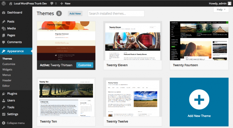 Last, but certainly not least, is a new experience for the Themes selection area of the WordPress admin.
Many developers don’t use this area too often, but users do, and the new theme experience is truly fantastic.
Every aspect of theme selection from within the dashboard is new. The design and layout is new, the interface itself is new. It feels very much in line with the way the Customizer works now. It’s faster, easier, and has better aesthetics. The project was led by Matías Ventura.
Other new features and changes
Widgets
Widget management has been adjusted and improved in WordPress 3.8 to put more focus on sidebars and less on the available widgets. The widgets are also click/tap-to-add now, which makes them much easier for managing on touch devices than the drag and drop method from before.
This is another area that has a feature-as-plugin project of its own in the works, but this is a great change in the meantime.
Responsive theme tags
New tags have been added to the theme search utility to indicate responsive-layout, fluid-layout, and fixed-layout. This has been a requested feature for some time. Another new tag for accessibility-ready has also been added.
Theme Screenshot sizes
More for theme developers, theme screenshot sizes have changed again to be 880×660, up from 600×450. This is to account for the new theme experience.
New about page
WordPress shows a page about new releases after upgrades in the dashboard, and for a few releases now these have been quite good. WordPress 3.8’s is no different, and even includes a working admin theme changer. I used some of the images from the new about page in this blog post. Definitely go check it out.
Rapid development cycle
This is the second rapid release cycle for WordPress, and the shortest time between major versions ever. Though with the shift to features-as-plugins driven development, the development cycle (a subtle but significantly different thing than the release cycle) has been a more standard four months. As most readers will know, WordPress 3.8 development started at the same time as WordPress 3.7.
I’m not sure how often this will be done in the future. It appears to me that simultaneous development cycles, while it worked well, may be rather unique to the type of releases WordPress 3.7 and 3.8 have been. I would suspect that in the future, we’ll still see shorter times between release cycles, but perhaps not as often see full-on simultaneous development between major versions.
However, it seems pretty clear that we will see features-as-plugins sometimes span multiple major release cycles as they prepare for the proposal process and core merging. I hope that this makes for a less stressful environment for new contributors to get involved in WordPress core development.
What is the future of WordPress development?
This is definitely a new time for core WordPress development. I imagine it will continue to evolve over several new releases. Long term, I believe it is inevitable that we will start to view releases for WordPress like we do Chrome and Firefox; meaning, I don’t know what version of Chrome I am running. I think that our timelines, eventually, will be much less about what date a version of WordPress was released and more about what date a feature of WordPress was merged.
I think WordPress 3.8 is an outstanding new release, and I offer major congratulations to everyone involved. This project never ceases to amaze me.

Great coverage Brian. This is an excellent resource to send clients to. Great work.
Minor quibble: The new preferred theme screenshot size is 880×660, not 640.
Fixed! Thanks for the eagle eye, Otto!
Great info sir!. We use WordPress as the prefer platform for clients and Parker should be once again a huge improvement.
We just dived into a new project today and had the incredible chance to try out 3.8 in a real project. We love it!
The new admin already saved us tons of hours!
The overall impression from 3.8. is all thumbs up!
Great achievement for the whole team that worked on the update. Thank you!!!
Thanks for the in-depth review Brian, and congrats for everyone behind this update. However, I think most WordPresser’s, including me, aren’t very much interested in these aesthetics updates. The team should focus more on stability and security.
i still didnt try the new version of wordpress im afraid about that
I hope subsequent releases improve on this because in some places the changes make UX ten times worse. IN some places it feels cleaner, in others the removal of demarcation between different areas brings confusion.
For example, the lack of separators in menu, seems trivial but for users it adds to overwhelming nature of dashboard. Other places where this update fails include the widget page and the theme page, where bigger thumbs are not necessarily better.
i just installed wordpress version 3.8 codename parker on my site. i am indonesian. hello, parker!
I can not find how can we change the author display picture.
Happy to hear about this! Love the new UI.
Before the WP is look old and ugly. now is better. I hope they keep working hard like this and start making the WP 4 which is much better and bigger improvement.
A very nice update. I love these colorful UI.
Brian- Great overview! We included it in our Monthly Resource Roundup http://www.wiredtree.com/blog/the-monthly-round-up-decembers-best-web-designdevelopment-cms-and-security-content/
Cheers!
Very, very, very slow after upgrade. I want my 3.7 back. How can I downgrade?
I find it interesting how the default theme in this version is actually more complex in many ways. And above and beyond the basic structure we’ve seen before…nicely illustrates the growth WordPress has experience.
I more like wordpress 3.8 than 4.0, maybe because many plugin that i have is already out of date, so i’m affraid it will not compatible with new 4.0