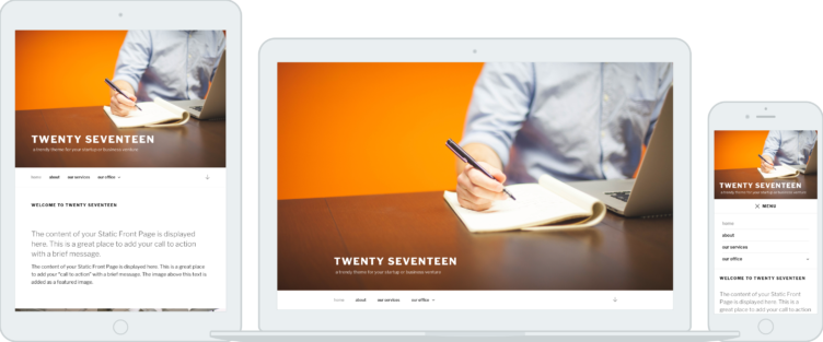
I have not been stunned — in a positive way — about a default WordPress theme design preview since Twenty Twelve. I haven’t had a major beef with any of the other default themes, but I haven’t been really wowed.
- Twenty Ten was a huge step because it was the first of the series and a break from Kubrick.
- Twenty Eleven was an interesting (as the first responsive theme) continuation of a style similar to Twenty Ten.
- Twenty Twelve was the first time WordPress didn’t look like “just a blog” out of the box, and that got me really pumped.
- Twenty Thirteen and Twenty Fourteen were niche and very opinionated designs, and that was fine, if neither were to my personal design preferences.
- Twenty Fifteen was a welcome re-simplification of a blog theme.
- Twenty Sixteen was nice, but not groundbreaking, nor to my tastes again.
- Twenty Seventeen is the kind of theme I’ve been waiting for.
The high fidelity mockups do it better justice than the announcement post.

The promo image actually doesn’t do it justice either, because you’re left thinking it’s just a regular default them with a new fancy full screen image. The full home page mockup is when you really see what’s new for Twenty Seventeen.
This theme, by default, is for businesses. And that’s a huge deal.
We all know WordPress is a great tool for business websites. But I bet your real life interactions are similar to mine: every time I talk to friends about WordPress, they still think about blogs, or at best other small entities like photography or portfolio sites, unless they are already working with the web in some capacity for their job.
Twenty Seventeen can set a tone from the moment someone installs WordPress, or sees a default WordPress demo, that WordPress is not just capable of doing more, but that it is made for it.
Better theme tools in core
In addition to the design, it looks like 4.7 is shaping up to also be a good release for theme-oriented tools and functionality.
One such example sounds minor, but helps a ton with proper customization of WordPress themes. John Blackbourn highlights on Make Core the introduction of get_theme_file_uri() to work similarly to get_template_part(), in that it allows a hierarchy for child themes to override parent theme assets (JavaScript, CSS, images, etc).
In other words, this enables theme developers to allow granular customizations in child themes, simply by including references to files using this function, which allows a child theme tinkerer to replace the file with their own; it works just like get_template_part().
John’s post also highlights the {$type}_template_hierarchy filter, which will allow people to make arbitrary customizations to the theme hierarchy, enabling much more advanced and granular template changes. One example he used in the description was to define a template hierarchy layer based on term meta definitions for a category.
So let’s say I have term meta on my category edit screen where I can check a box for fancy-layout and the fancy layout has options for various templates. And these options can be completely arbitrary from other definitions in the template hierarchy, which are more strictly tiered based on specificity.
There is near unlimited flexibility for ways to use this to empower website developers to go wild with templates.
Helen notes some specific objectives for Twenty Seventen as well:
- A better flow for using a static page as your front page.
- Visible edit icons in the Customizer, replacing the current hidden shift+click method.
- Expanding custom header images to include video (think: atmospheric video headers!).
- Dummy content for live previews.
Dummy content for live previews is extremely important to me. It would significantly enhance the theme preview experience, and better yet, it would help set a standard for commercial themes.
I imagine there will be a ton of effort over the next few months to improve theme experiences, and to make Twenty Seventeen happen.
If you look back at that home page mockup, and the other previews, there are several things that stand out, where I’m not sure what a core implementation would look like:
- Mel called the home page mockup a “Multi page” preview. Does that mean there would be a theme option to show several pages on one? Or could this be implemented as some kind of content blocks in the customizer thing?
- Pullquotes are in the design. How would these be handled?
- And what about that map on the contact page?
There are some themes on WordPress.com that have a multi-panel home page, that use a theme options customizer panel, where within that there options for setting a page as a panel on the home page.
Tammie Lister — who works at Automattic — actually made a ticket on Trac just a couple days ago to propose a multi-panel feature through add_theme_support().
There are no guarantees for how the Twenty Seventeen implementation will work, and a lot could change based on what comes up in meetings and experimentation, but WordPress.com and the limitations they face with content types and whatnot, will likely be the primary source of inspiration and guidance.
Keep an eye on Twenty Seventeen. It will be important in its own right as the default WordPress theme, but it could also really change the game for how to structure theme customizations generally.

