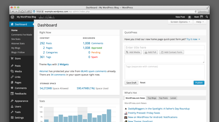
WordPress.com has launched the MP6 dashboard redesign to everyone this morning. The comments on Matt Thomas’ announcement post are pretty enlightening as to how regular folks feel, and also a bit entertaining. In short, most are happy and some are very unhappy. Not many people are in the middle. I do think a couple of commenters have a good point that a complementary “light” color scheme would be nice. However, an easy to use admin theme API (for dot org) would be even better!
2 thoughts on “WordPress.com launches MP6 dashboard redesign”
Comments are closed.


What do you mean “easy to use API”? I’m under the impression that the backend of WordPress is way too convoluted for techno-phobes. I’m curious what your ideas might be for something more streamlined.
Along the same note, have you looked at HappyTables’ backend? It’s not perfect, but it’s a lot simpler than the standard WordPress system.
Hey Jason 🙂 I’m very familiar with Happy Tables, fortunately! The point of my note was that, yes, it needs massive improvement for developers to customize the admin.
I agree with Noel on a way forward, and what he wrote in this post on the WordPress admin