
Post Status has been iterating quite a bit over the last six months since it launched.
However, not everyone noticed.
I’m excited to launch a redesign that reflects the changing purpose that Post Status serves. It started as a link blog, where I wanted to have a lot of input from readers to submit posts. Over time, the site has evolved from that. I realized that readers really preferred when I filtered content for them. I also received a great deal of positive reinforcement when I wrote long form content. And I discovered that I often wanted to say more than I could given room I allowed myself with only the link format.
So, I’ve slowly been writing more original content. I’ve also been more stringent as to what submitted content I approve, and I tend to add commentary to the links I post. The new design reflects this change, and more.
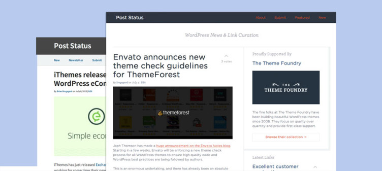
The new design
The latest link posts are now visible on every page in the large sidebar. However, the main home page column will consist of long-form content. I think this lets me showcase long form content for longer periods, while still offering a consistent daily feed of links. Hopefully this will help deliver the right mix of consistent news and further insight when it is merited.
I nerded out pretty hard on the fonts. I subscribed to the new H&FJ Cloud Typography plan and I’m rocking out Gotham Rounded and Archer on this site.
I also went a bit flatter, and restructured quite a bit layout-wise. Be sure to check out the mobile view too. The long-form content and the linked posts are both available easily, right from the top. No sidebar dumping here.
I hope you like the new design. I hastened my launch schedule by a couple of weeks due to unforeseen circumstances, so I’ll be cleaning up bits and pieces over time. Your constructive feedback is welcome, of course.